Rachel Faye Photography re-brand
Objective
A close friend of mine, a professional photographer, approached me to help strengthen her brand identity. Up to that point, most of her business had come through word of mouth and social media, but she wanted a visual identity that would give her brand a more polished, professional edge. It was the perfect opportunity for me to deepen my experience with logo design and apply.
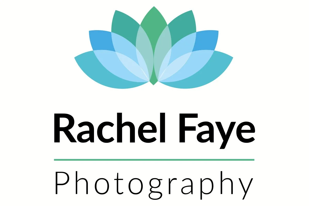
With a tight deadline, I made use of some pre-prepared logo templates I’d developed in my spare time, adapting them to suit her photography style. Normally, my process begins with concept sketches and several distinct directions typically five or six so clients can clearly see how my ideas evolve from rough concept to refined design. In this case, I wanted the brand mark to feel clean, so I built it around a shutter-like shape inspired by the aperture of a camera lens.
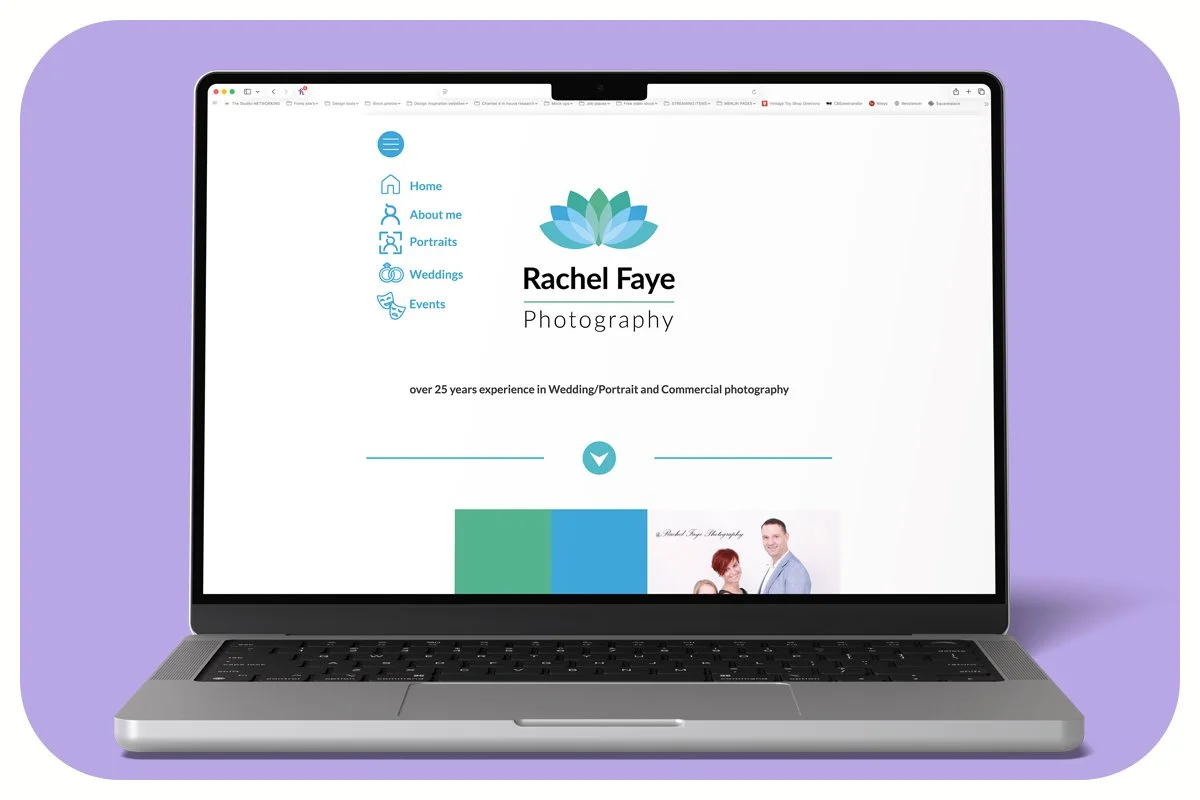
The final logo was minimalistic, working beautifully across her stationery set from business cards and letterheads to brochures and compliment slips. The simplicity of the design allowed her photography to take centre stage while giving her a consistent, professional brand identity that supported her growing reputation.