Freelance Logo Design – InSpirals Street Food
Objective
One of my closest friends approached me to design a logo for his new business, a street food truck specialising in healthy spiralised cuisine. Before beginning the creative process, I gathered all the key details about his brand the company name, target audience, and overall vision. He wanted something fun and memorable a logo that featured food being spiralised by a fork, paired with a slogan that tied together themes of street food and healthy eating.
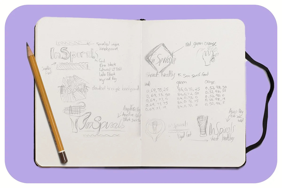
From the start, I knew the concept would be visually challenging. Representing spiralised food in a way that felt dynamic, clear, and appetising all within a compact logo mark required some problem solving. I explored several sketch ideas, experimenting with shapes, typography, and motion cues to capture that sense of freshness.
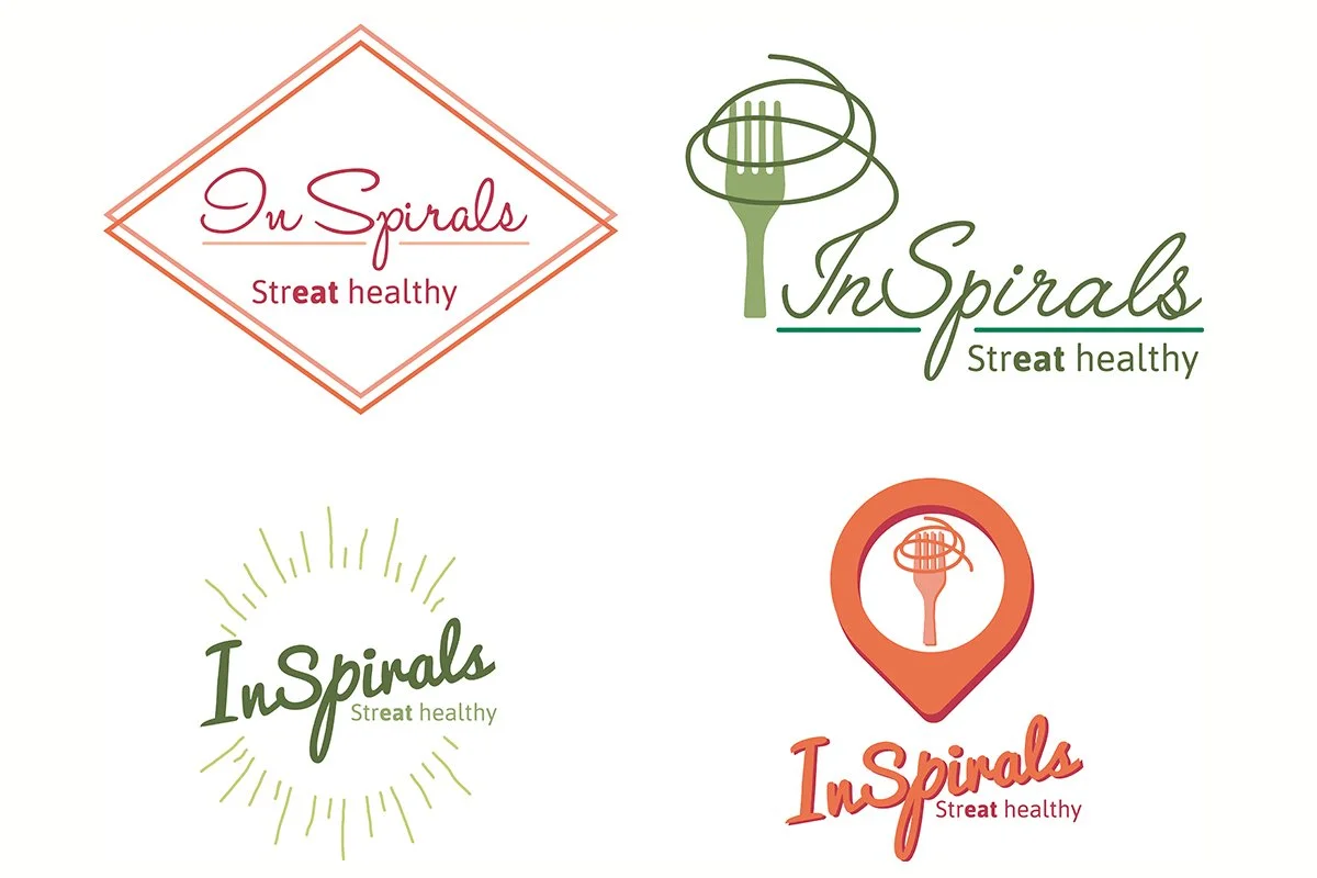
After several iterations, I developed four distinct design variations, each highlighting the spiralised motif in a different way. While the concept pushed me outside my usual design comfort zone, it proved to be a valuable creative challenge one that strengthened my ability to visualise complex ideas and translate them into clean, engaging logo.


